Design System

A complete reference for the visual and interactive language of this portfolio. Covers color tokens, typography, spacing, layout, components, motion, and breakpoints.

01 — Color

Background --bg #FAFAF8
Text --text #111111
Accent --accent #35528c
Muted --muted #888888
Surface --surface #F2F1ED
Divider rgba(0,0,0,.09)

02 — Typography

Display font

Syne

Used for all headings, the navbar logo, tags, and numerals. Weight 700 and 800.

Body font

DM Sans

Used for all body text, meta, descriptions. Weights 400 and 500.

Hero / Marquee Font: Syne 800
Size: clamp(4.5rem, 18vw, 15rem)
Line-height: 1.0
Letter-spacing: −0.04em
Herman
Page Title / H1 Font: Syne 800
Size: clamp(3rem, 7vw, 8rem)
Line-height: 0.95
Letter-spacing: −0.05em
Projects
Project Heading / H2 Font: Syne 800
Size: clamp(1.75rem, 3vw, 3rem)
Line-height: 1.0
Letter-spacing: −0.04em
Gjøvik Tech Racing
Featured Card / H3 Font: Syne 800
Size: clamp(1.25rem, 2.2vw, 1.875rem)
Line-height: 1.0
Letter-spacing: −0.03em
SIM-innlandet AR
Hero Subtitle Font: Syne 700
Size: clamp(1rem, 1.8vw, 1.375rem)
Letter-spacing: +0.01em
Color: --accent
Interaction Design Student, NTNU
Body / Summary Font: DM Sans 400
Size: 1rem (16px)
Line-height: 1.75
Color: --muted
Designing user-centered, visually clear, and well-structured digital solutions that serve both the people who use them and the organizations behind them.
Nav / UI Small Font: DM Sans 500
Size: 0.875rem (14px)
Letter-spacing: +0.02em
Color: --muted → --text
Home  ·  Projects  ·  About  ·  Contact
Section Label Font: DM Sans 500
Size: 0.75rem (12px)
Letter-spacing: +0.14em
Text-transform: uppercase

03 — Spacing

Base unit is 4px. All spacing values are multiples of 4. The scale below lists every value used across the site, with its primary context.

4px 0.25rem
8px 0.5rem: tag gap, small nudges
12px 0.75rem: footer links gap
14px 0.875rem: section label gap
16px 1rem: compact gaps, mobile padding
20px 1.25rem: wip badge margin, hover indent
24px 1.5rem: mobile container padding
28px 1.75rem: proj summary margin-bottom
36px 2.25rem: feat-card padding, footer
40px 2.5rem: nav link gap, grid gap
48px 3rem: about margins, detail gap
56px 3.5rem: container padding, section label margin
60px 3.75rem: proj body gap, cta margin
72px 4.5rem: navbar height (--nav-h)
80px 5rem: hero bottom, projects list margin
96px 6rem: page header top offset
100px 6.25rem: section padding, about padding

04 — Layout

Max content width

1200px

Applied via .container, centers content on wide viewports

Container padding

0 56px  →  0 24px (≤768px)

Horizontal breathing room on either side of the content column

Navbar height

72px (--nav-h)

Fixed. Used as offset token for page header top padding

Featured card grid

72px 1fr 380px

Number · info · image. Collapses to 56px 1fr on mobile, image hidden

Project card grid

72px 1fr

Number · body. Body is 1fr 420px, collapses to 1fr at ≤1024px

About intro grid

1.2fr 1fr  gap 100px

Bio · details. Collapses to 1fr at ≤1024px

Experience item grid

160px 1fr  gap 40px

Period · role/company/desc. Collapses to 1fr at ≤768px

Skills grid

repeat(auto-fill, minmax(170px, 1fr))  gap 2px

Auto-responsive tile grid

Section padding

100px 0  →  64px 0 (≤768px)

Vertical rhythm for all .section blocks

2px gap system

gap: 2px

Used between grid tiles throughout the site to create a subtle seam, not a gutter

05 — Components

Section Label
.section-label · DM Sans 500 · 0.75rem · letter-spacing 0.14em · uppercase · color --muted
::before pseudo: 32×1px --muted line
Tag
UX Research Prototyping Mobile First 2026
.tag · DM Sans 500 · 0.6875rem · letter-spacing 0.1em · uppercase
color --muted · background --surface · padding 5px 12px · border-radius 2px
WIP Badge
Work in progress
.wip-badge · DM Sans 500 · 0.6875rem · letter-spacing 0.12em · uppercase · color --accent
.wip-dot: 7px circle --accent · animation wip-pulse 1.8s infinite (opacity 1→0.25→1)
CTA Link
.cta-link · Syne 700 · 1rem · letter-spacing -0.01em
border-bottom 2px --accent · padding-bottom 4px
hover: color --accent · gap grows 10px→18px (transition .25s ease-out)
Skill Tile
Figma Prototyping UX Research
.skill · Syne 700 · 0.9375rem · letter-spacing -0.01em · background --surface · padding 22px 24px
hover: background --text · color --bg (transition .2s ease)
Design System Icon (Navbar)
.navbar-ds-icon · 15×15px SVG · 4-square grid icon
color --muted on default · color --text on hover · color --text + active underline on active page
Divider
border-top/bottom: 1px solid rgba(0,0,0,.09)
Used between project cards, experience items, contact rows, footer
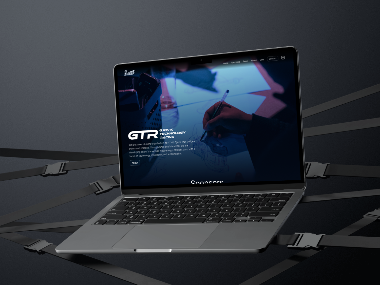
Image hover treatment
GTR macbook
Default: grayscale(100%)
Hover: grayscale(0%) + scale(1.06)
filter transition: 0.45s ease-out
transform transition: 0.55s ease-out
img · filter grayscale(100%) · transition filter .45s ease-out, transform .55s ease-out
.proj-card:hover img → filter grayscale(0%) · transform scale(1.06)
Custom Cursor
Default
On link
#cursor · 12×12px circle · background --text · hidden on touch devices
.link-hover state: 44×44px · background --accent · transition .2s ease-out
Triggered on: a, button, .proj-card, .feat-card, .skill, .contact-row

06 — Motion

Fade up (scroll)

opacity 0→1 + translateY 36px→0
transition: .7s ease-out
delay: i × 0.08s (max 5 items)

Applied via .fade-up class + IntersectionObserver. Triggers once when element enters viewport at threshold 0.08.

Name marquee

translateX(−50%) → translateX(0%)
timing: linear, infinite loop
Herman: 8s · Brenn: 14s · Svendsen: 7s

Each name is duplicated. At −50% the second copy is visible; at 0% the first copy is visible. Seamless because both copies are identical.

Navbar scroll

background + backdrop-filter + box-shadow
transition: .35s ease

Activates .scrolled class when window.scrollY > 16px. Adds rgba background with blur(20px) frosted glass effect.

Nav underline

width 0→100%
transition: .25s ease-out

2px --accent line grows from left on hover and stays at 100% on .active page link.

Carousel crossfade

opacity 0→1
transition: .6s ease
interval: 3000–3500ms

Images stacked absolutely, crossfade via opacity. mix-blend-mode: multiply keeps light backgrounds transparent. Pauses on hover.

WIP dot pulse

opacity 1→0.25→1
animation: 1.8s ease-in-out infinite

7px --accent circle. Softly pulses to indicate an ongoing or live project state.

Contact row hover

padding-left 0→20px
transition: .25s ease-out
arrow: translate(10px, −10px)

Row slides right and the arrow moves diagonally up-right on hover. Value text transitions to --accent.

07 — Breakpoints

Desktop > 1024px Full two-column layouts, all images visible, 56px container padding
Tablet ≤ 1024px Project body collapses to 1fr. Image aspect-ratio becomes 16/9. About intro becomes single column.
Mobile ≤ 768px Hamburger menu. Container padding 24px. Featured card images hidden. All grids collapse to 1fr.

Responsive type: clamp() values

Hero marquee:     clamp(4.5rem, 18vw, 15rem) Page title H1:     clamp(3rem, 7vw, 8rem) Project H2:        clamp(1.75rem, 3vw, 3rem) Featured card H3: clamp(1.25rem, 2.2vw, 1.875rem) Hero subtitle:     clamp(1rem, 1.8vw, 1.375rem) Contact headline: clamp(3rem, 8vw, 9.5rem) About heading:     clamp(2.5rem, 5vw, 5rem)