01

Gjøvik Tech Racing

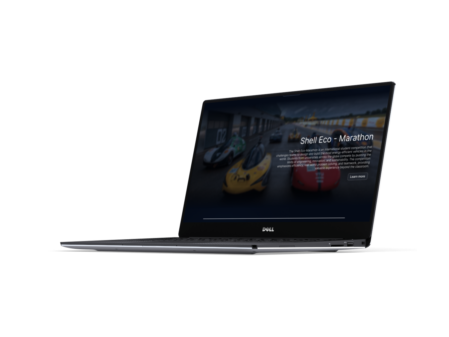
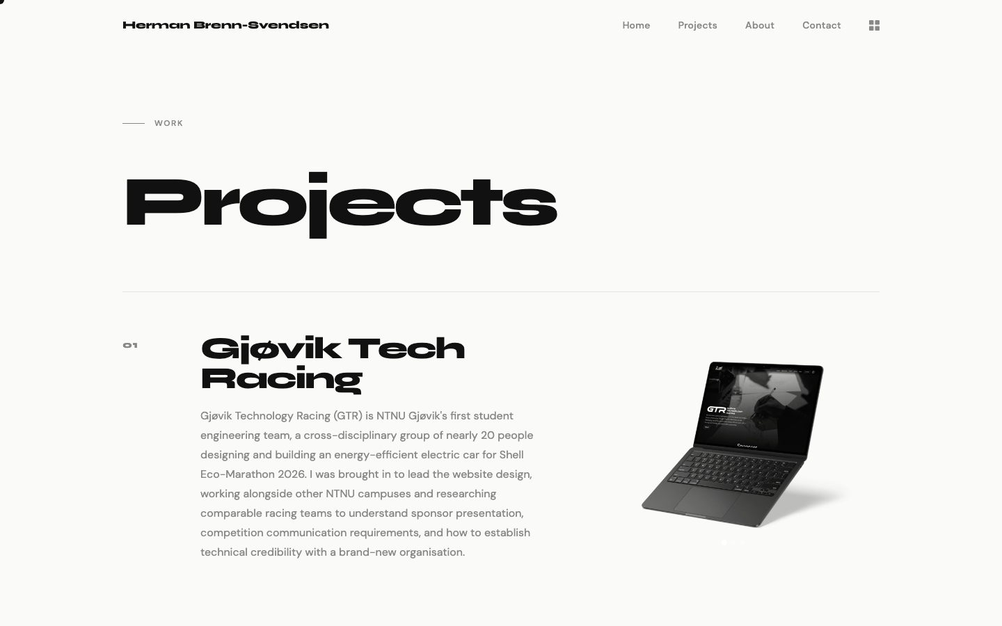
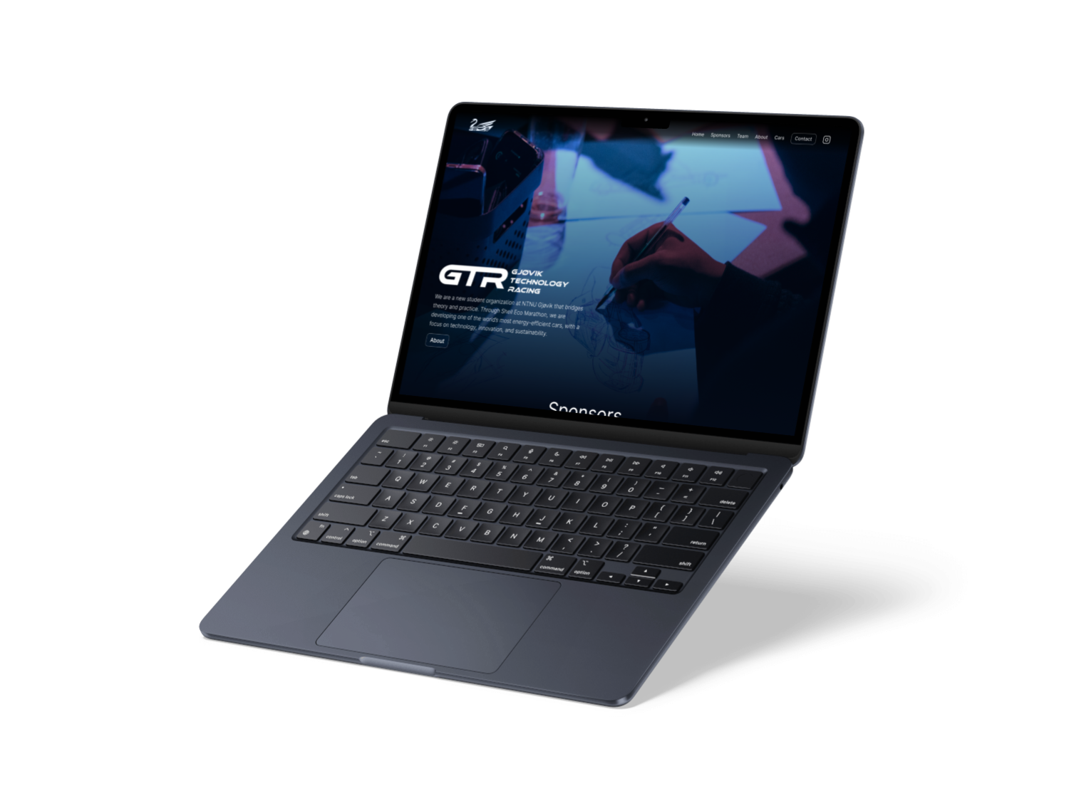
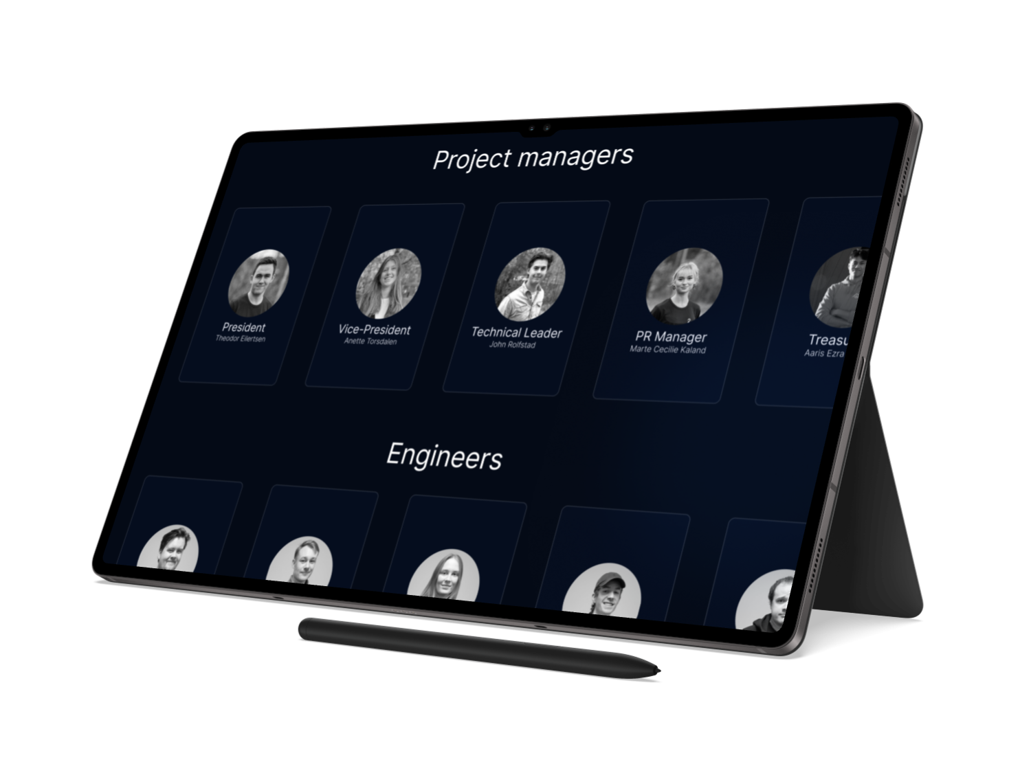
Gjøvik Technology Racing (GTR) is NTNU Gjøvik's first student engineering team, a cross-disciplinary group of nearly 20 people designing and building an energy-efficient electric car for Shell Eco-Marathon 2026. I was brought in to lead the website design, working alongside other NTNU campuses and researching comparable racing teams to understand sponsor presentation, competition communication requirements, and how to establish technical credibility with a brand-new organisation.

The design process began with an intensive benchmarking phase: studying student engineering teams, motorsport websites, and how they handle everything from sponsor logos to recruitment. From there I moved to hand sketches and low-fidelity layout drafts to test different information hierarchies and navigation models quickly, without committing to any visual direction. Special attention went to sponsor visibility rules and placement to align with competition and partnership guidelines.

Wireframes of core pages and user flows followed, before moving into high-fidelity design. The goal throughout was a site grounded in tested structure and stakeholder requirements rather than purely visual preference. The project is ongoing and will serve as the foundation for future GTR teams over the coming years.
UX Design Web Design Research Wireframing Prototyping 2026
02

Tjønnås & Norvald

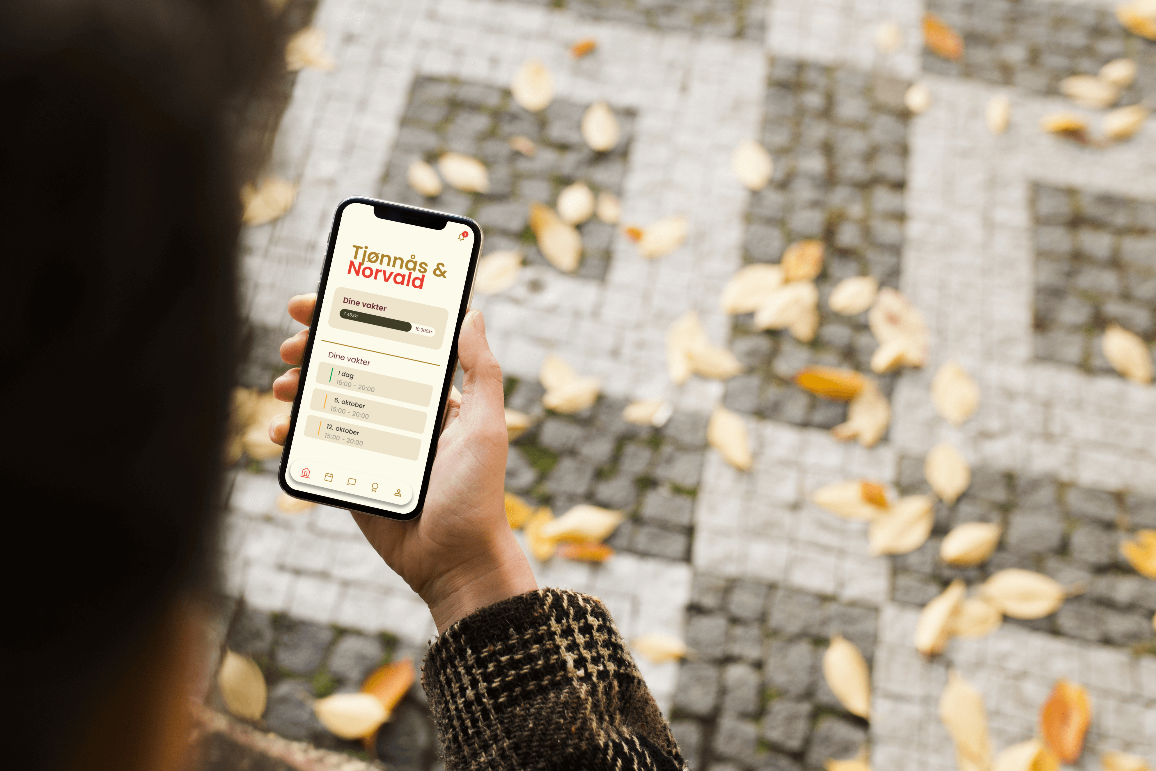
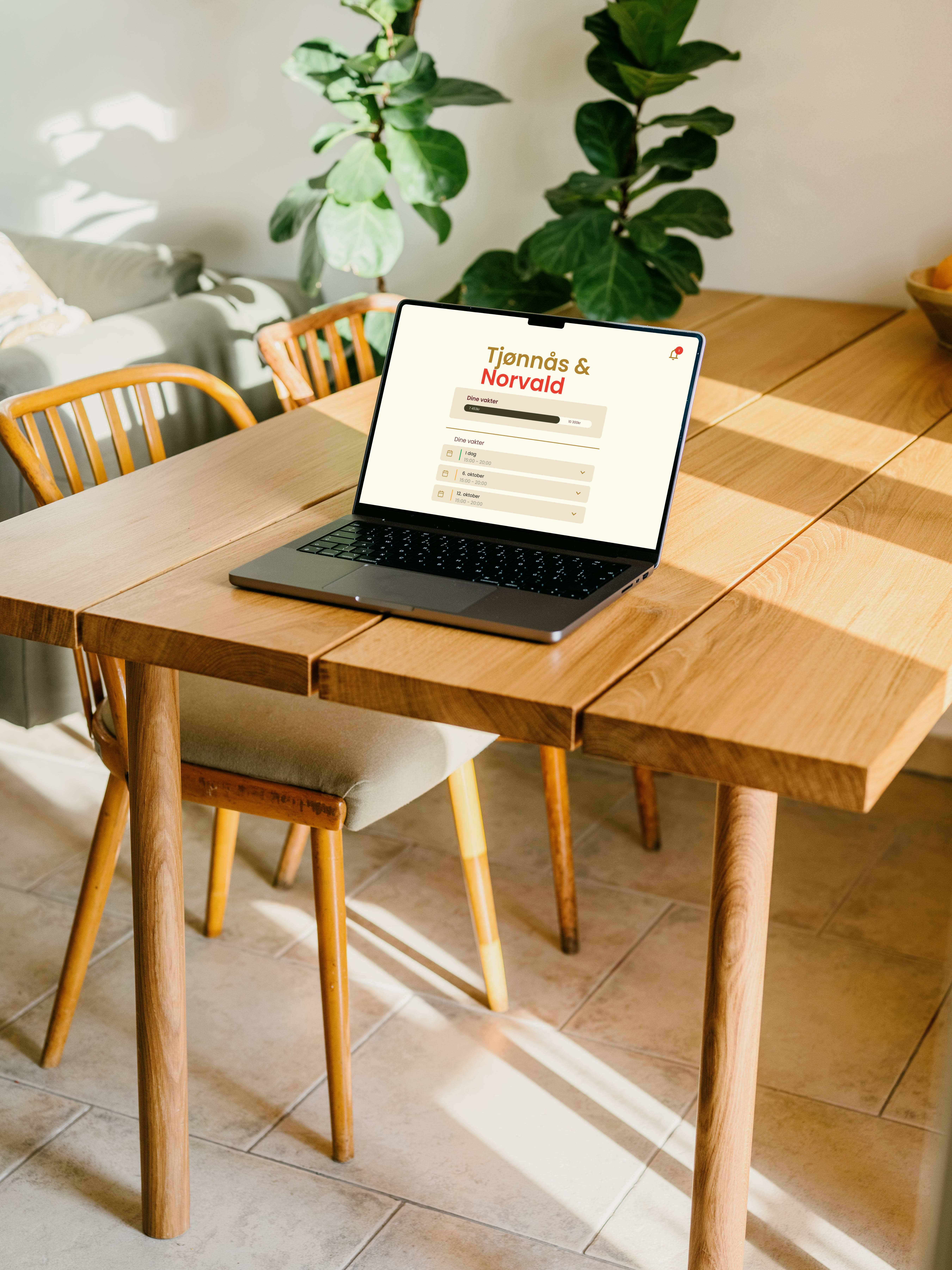
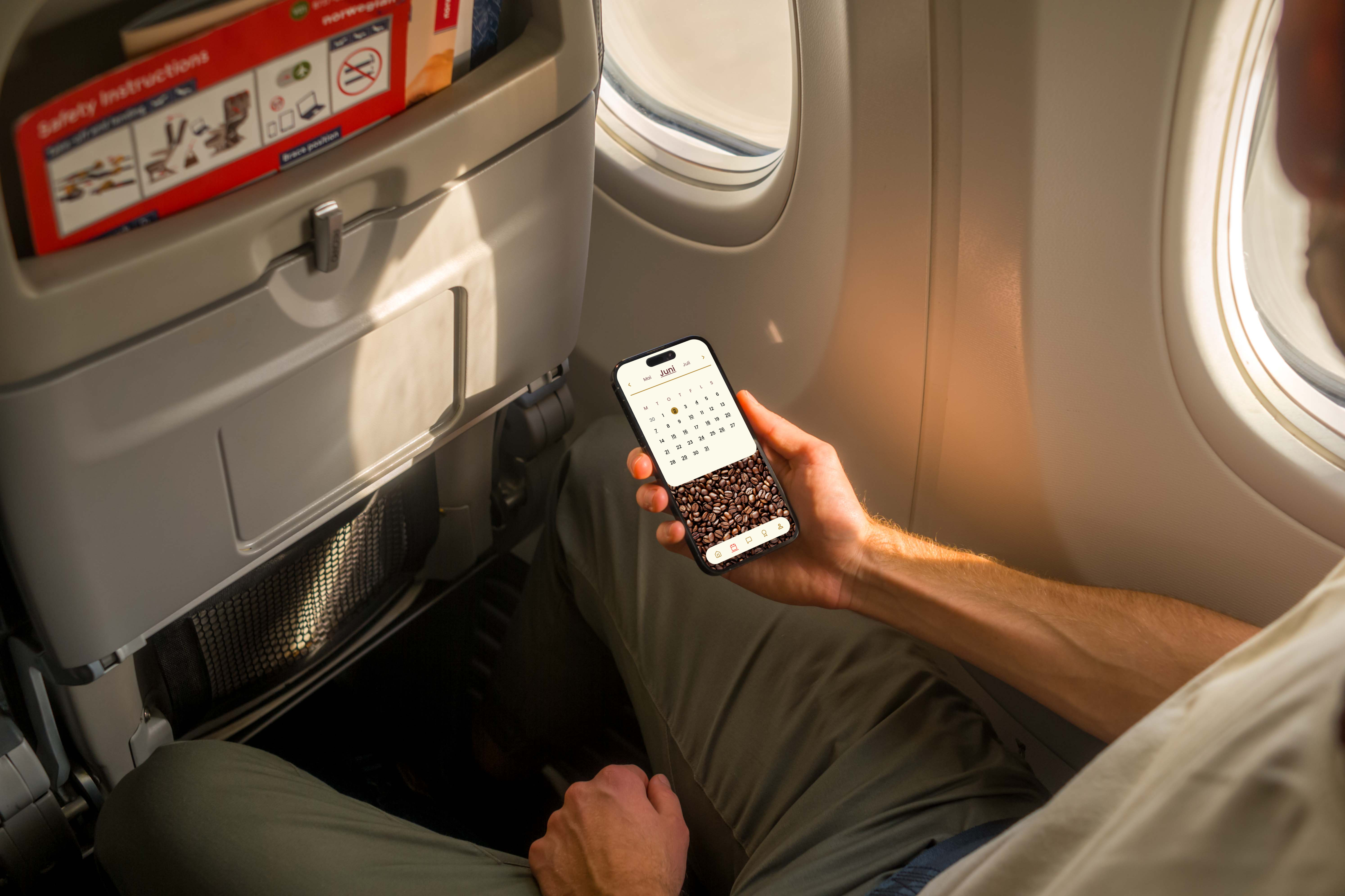
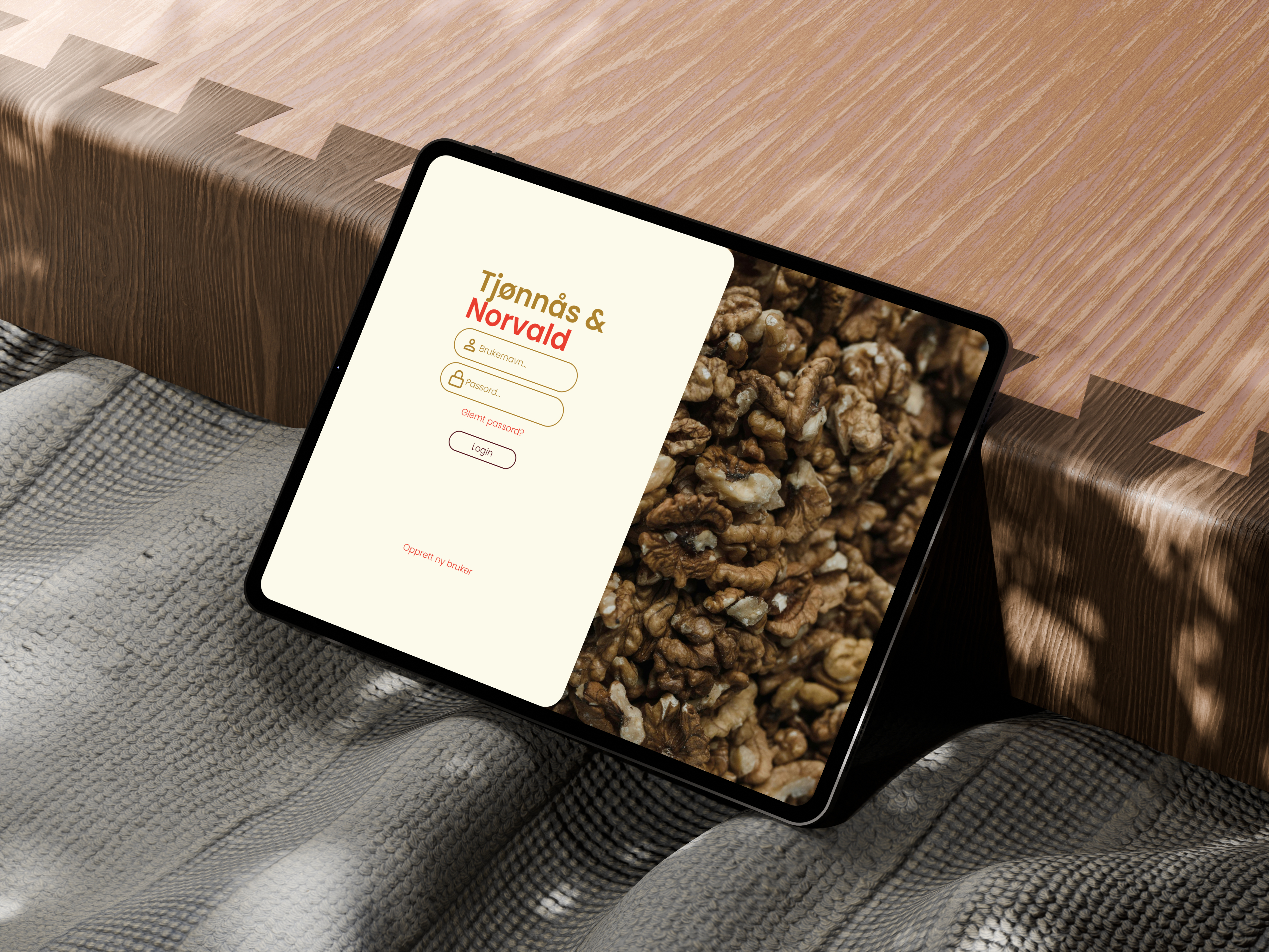
This project set out to replace a fragmented collection of internal systems at Tjønnås and Norvald with a single, cohesive employee portal. Through discovery work conducted with the general manager, we identified three recurring pain points: inefficient systems, weak internal communication, and limited access to training resources. That became our brief: design something that makes daily work more structured and predictable.

We started with a semi-structured interview supported by desk research and a clearly defined interview guide, assigning team roles beforehand to ensure thorough data capture. Findings were structured through affinity mapping, grouping observations into themes: shift planning, communication, training, and operational routines. From those themes we built personas and scenarios that made abstract problems concrete and kept the team aligned on what actually mattered.

A sitemap defined page structure and navigation logic before we moved into low-fidelity wireframes for both mobile and tablet/desktop. Concepts were iterated through internal reviews with a focus on user flow and feature placement. The resulting high-fidelity prototypes emphasise clear information architecture, simple navigation, and a visual expression consistent with the organisation's identity, demonstrating how a unified portal can reduce administrative overhead and strengthen everyday routines.

UX Research Information Architecture Affinity Mapping Prototyping Mobile 2025
03
Work in progress

Emanuel Vigeland Museum

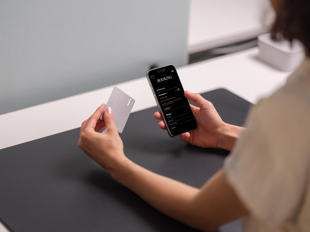
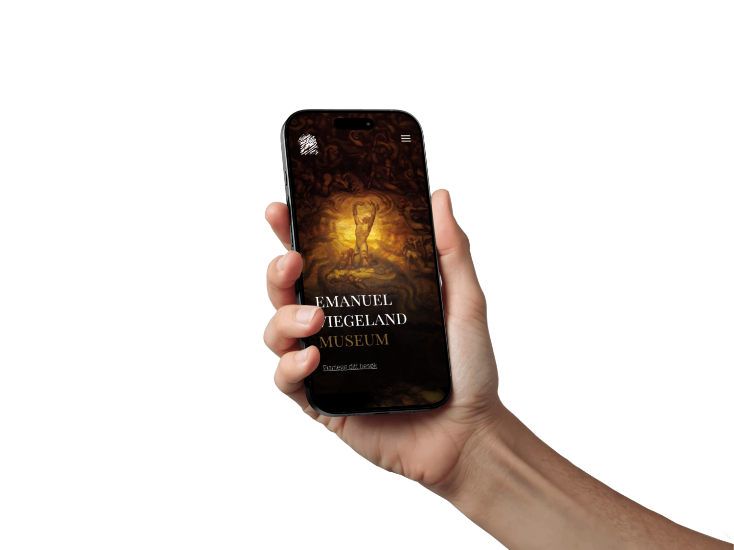
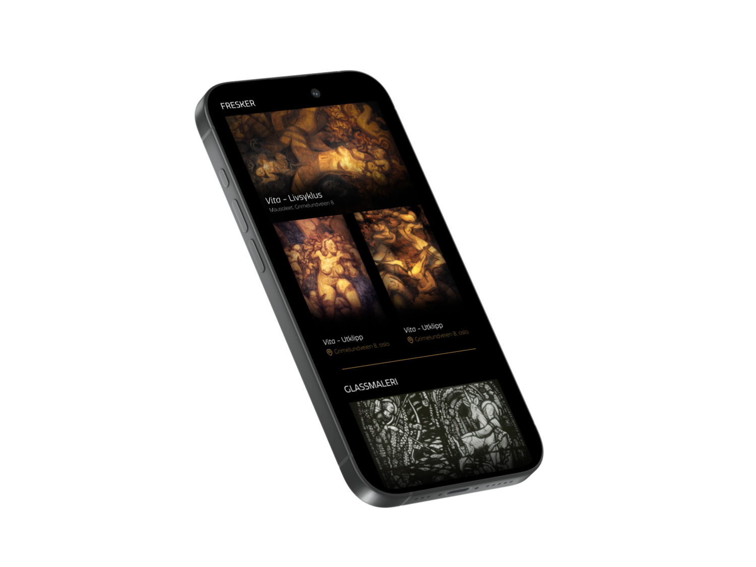
The Emanuel Vigeland Museum's website was launched in 2001, designed for early 2000s screen resolutions with no mobile consideration, and structured around a time when guided tours were the museum's primary activity. Today the museum hosts between 100 and 120 concerts a year in its unique mausoleum: a barrel-vaulted space with around 20 seconds of reverberation. Concert listings live almost entirely on Facebook, disconnected from the website. This project is a full redesign to bridge that gap.

Conducted as a cross-disciplinary group project in IDG2201: Design and Prototyping for Digital Products. The brief identifies three areas the new site must serve clearly: visitor information and ticketing, concert programming, and the museum's permanent collection. The approach is research-first: a UX evaluation of the existing site, priority mapping through MoSCoW analysis, and a progression from sitemaps and low-fidelity wireframes through iterative prototyping.

The final deliverable is a responsive, mobile-first high-fidelity prototype built in Figma, accompanied by a complete design system. Accessibility and WCAG compliance are core requirements, as is a functional booking system for concerts and events. The project is ongoing.

UX Research UX Evaluation Prototyping Design System Accessibility Mobile First 2026
04

SIM-innlandet AR

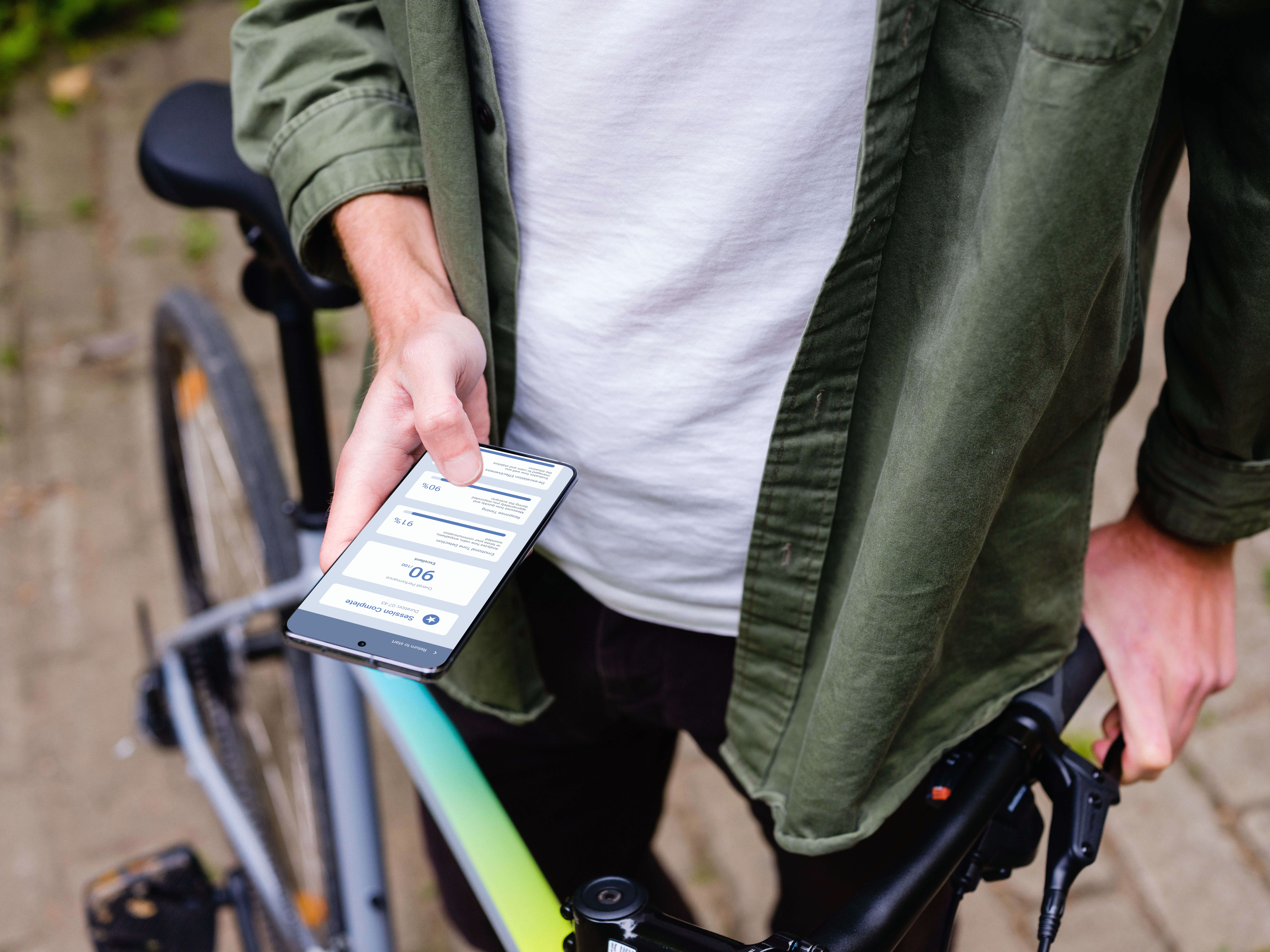
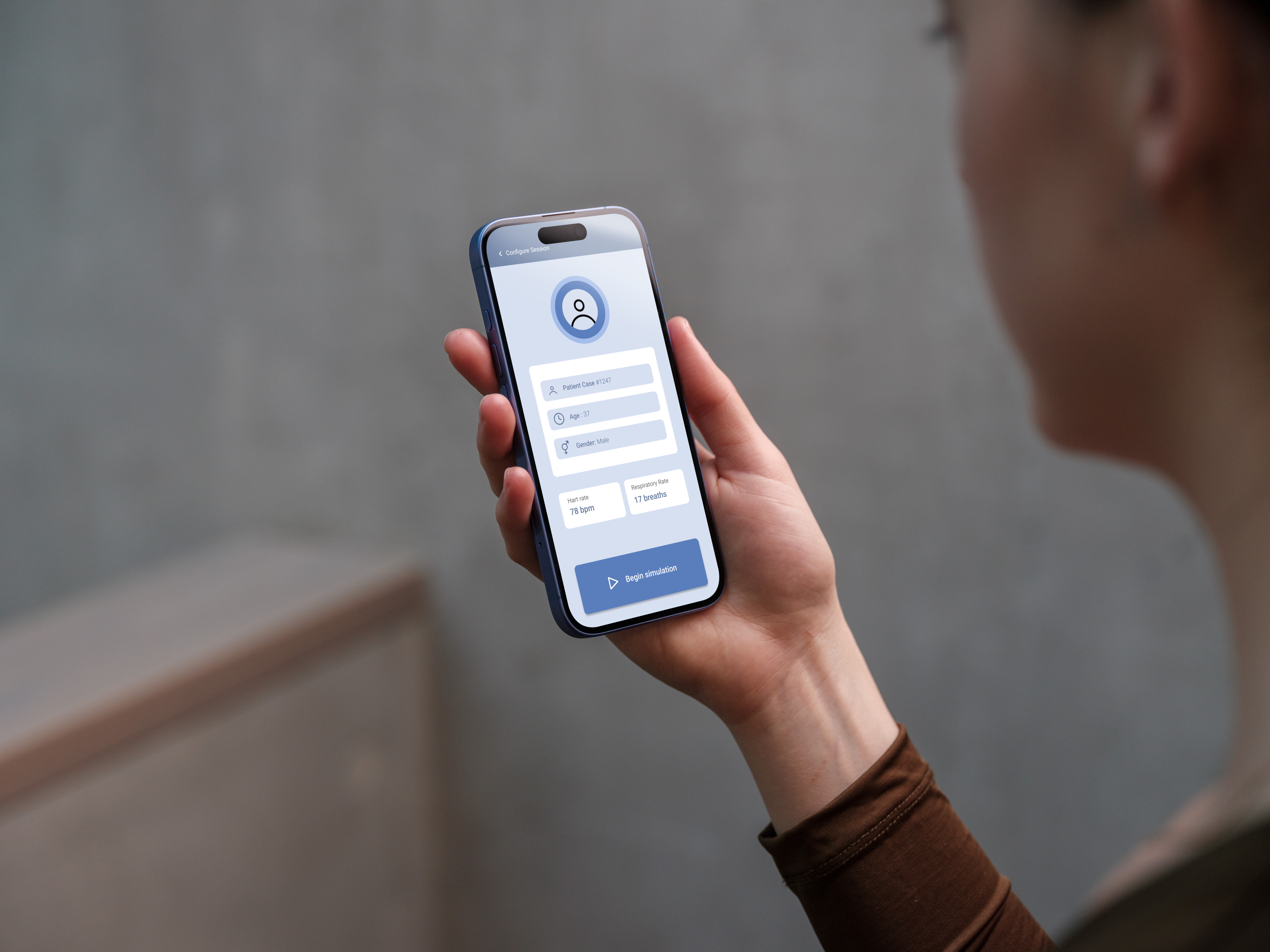
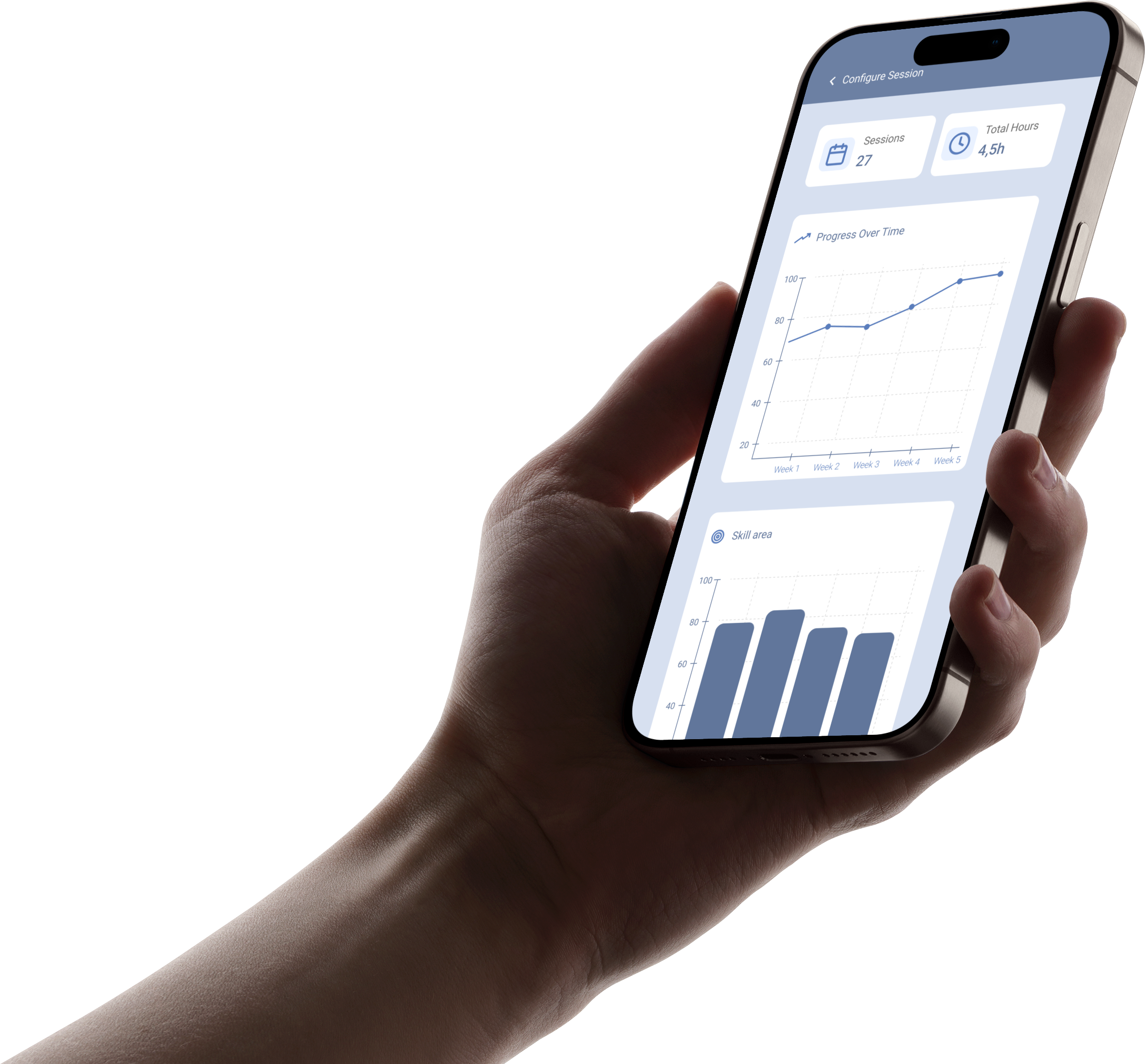
Developed in collaboration with SIM Innlandet, this project explores how augmented reality can make professional healthcare training more accessible. The concept is a mobile AR patient simulation that lets healthcare workers practise scenario-based mental health care anywhere, without the need for traditional simulation equipment or a dedicated facility.

The process started with early discovery work and direct dialogue with domain partners at SIM Innlandet to understand training needs, learning goals, and practical constraints specific to mental health care. Based on that insight we defined key scenarios and translated them into concrete user flows and interaction requirements. The app allows users to select different virtual patients, interact through microphone or keyboard input, and see dynamic vital signs (heart rate, respiratory rate) overlaid in AR.

Concept exploration moved from quick sketches and low-fidelity wireframes mapping core functionality, patient selection, and AR information layers through to interactive prototypes tested for scenario flow, interface simplicity, and feedback clarity. Each iteration focused on reducing friction, improving information hierarchy, and ensuring the simulation supported both communication training and clinical decision-making skills.

AR Design Mobile Healthcare Interaction Design Prototyping 2025
05

GolfConnect

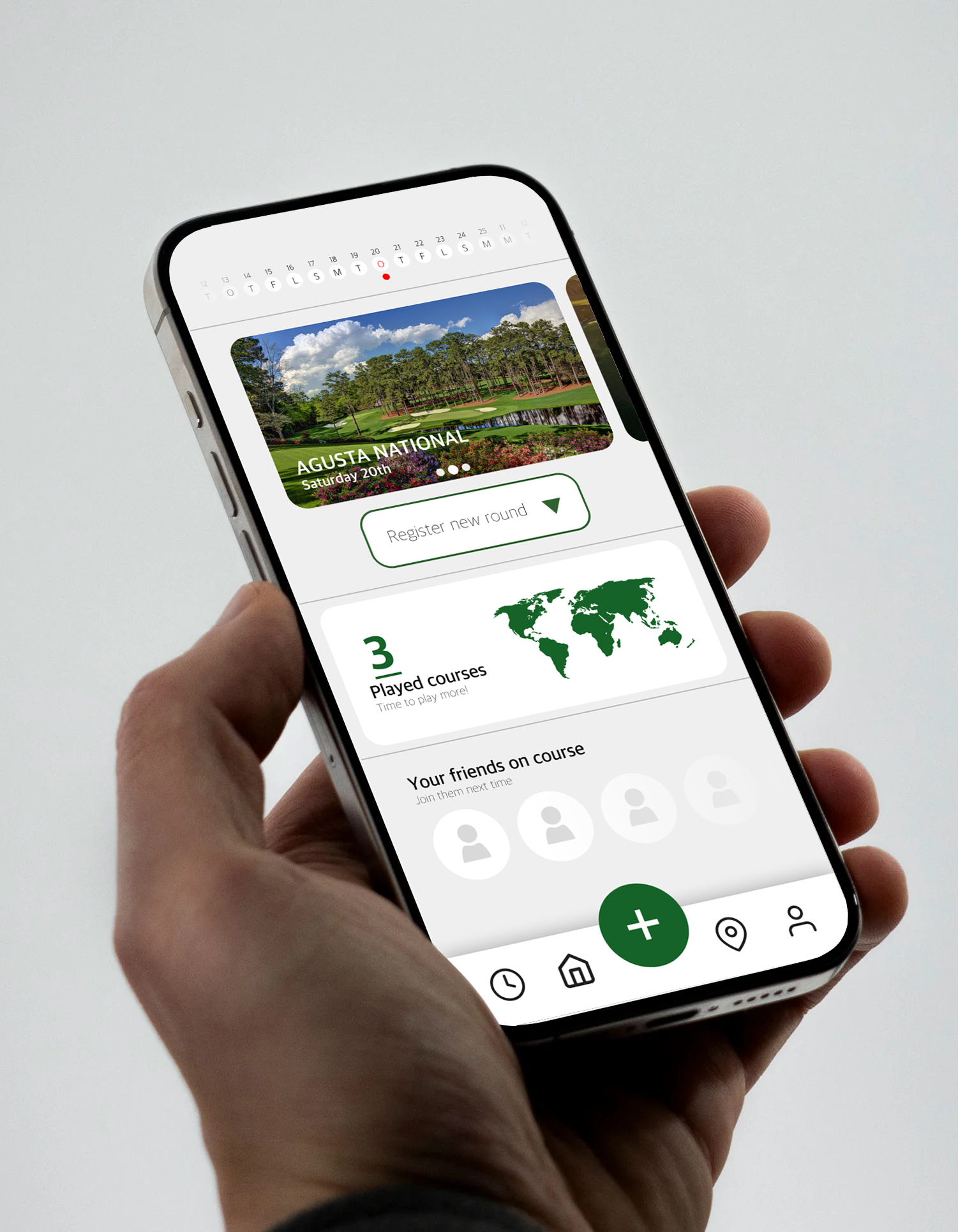
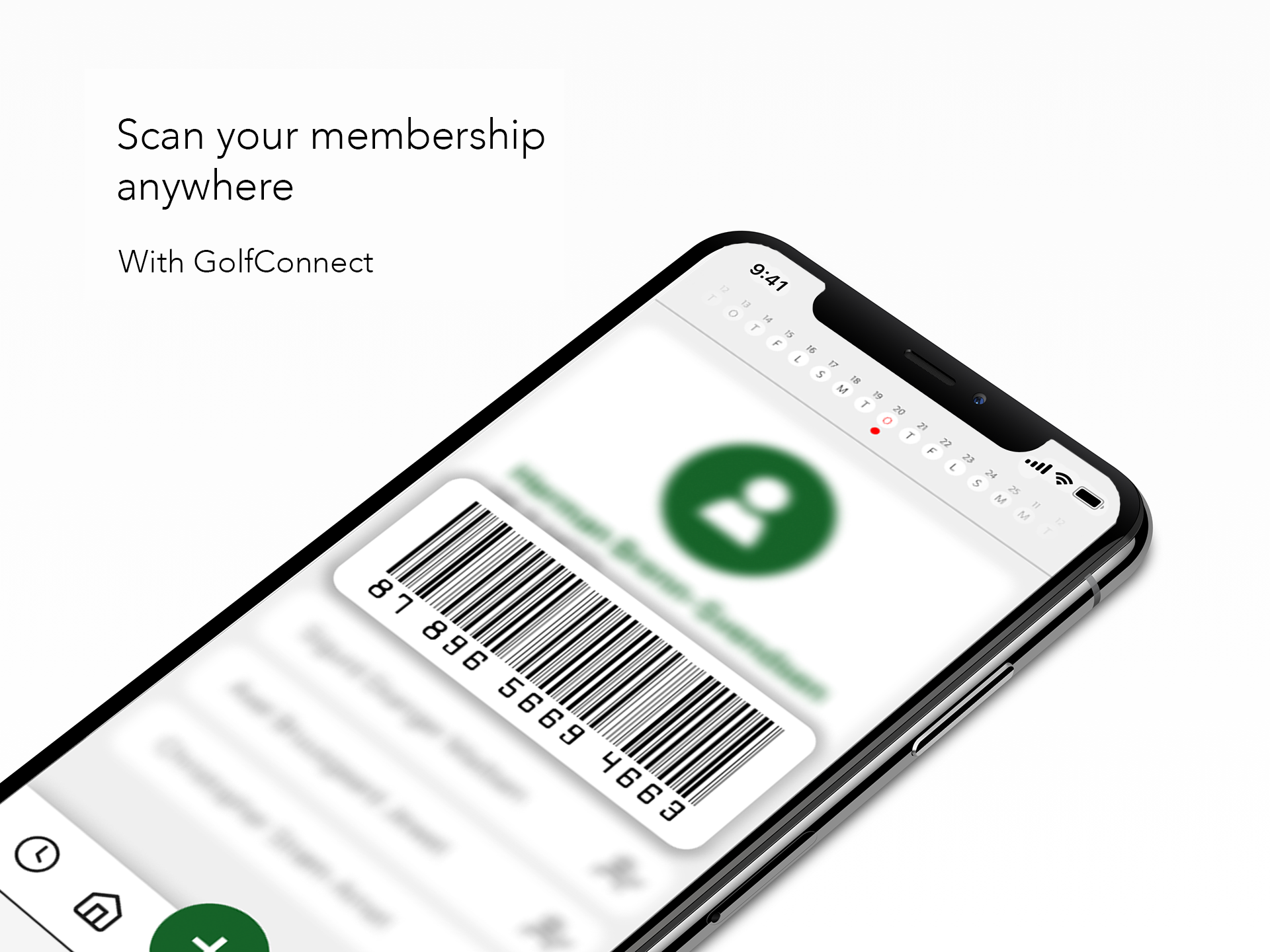
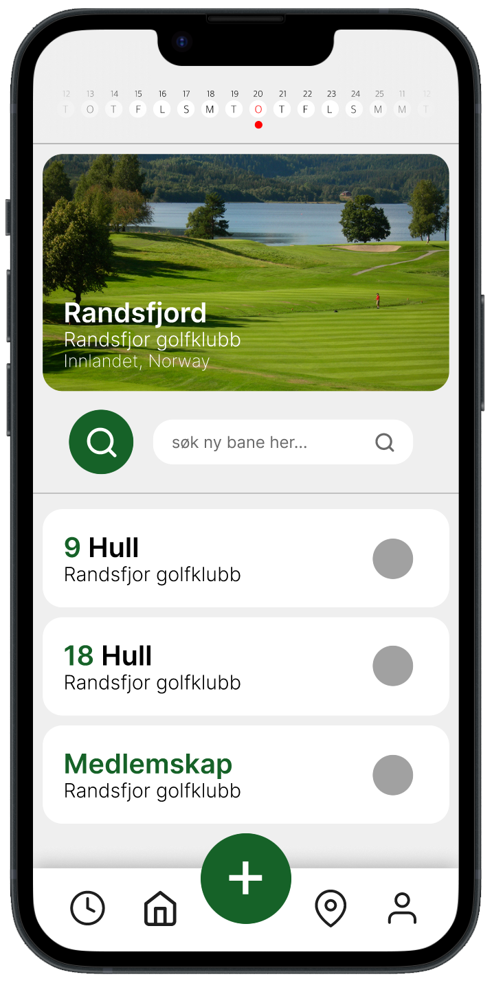
GolfConnect started as a personal project driven by genuine frustration with Gimmie (formerly Golfbox), Norway's dominant golf booking platform, widely criticised for its outdated UX and UI. Rather than accepting the status quo, I used it as an opportunity to ask: what would this look like if it were actually designed well?

I studied apps with comparable booking and social mechanics in other sports, primarily padel and tennis, to understand patterns that work: how they handle scheduling, social features, and calendar interactions. That research shaped GolfConnect's three core differentiators: real-time friend tracking so you can follow others live on the course, a course log for recording rounds you've played, and a horizontal scroll-friendly calendar that makes booking upcoming rounds feel effortless.

The visual direction balances a modern, clean aesthetic with just enough personality to feel lively rather than clinical. Simple, elegant details are applied with intention. Every interaction is designed to feel obvious on the first try. The result is an app that treats golfers as people who want technology to get out of their way.

Mobile App UI Design Personal Project 2025
06

Portfolio

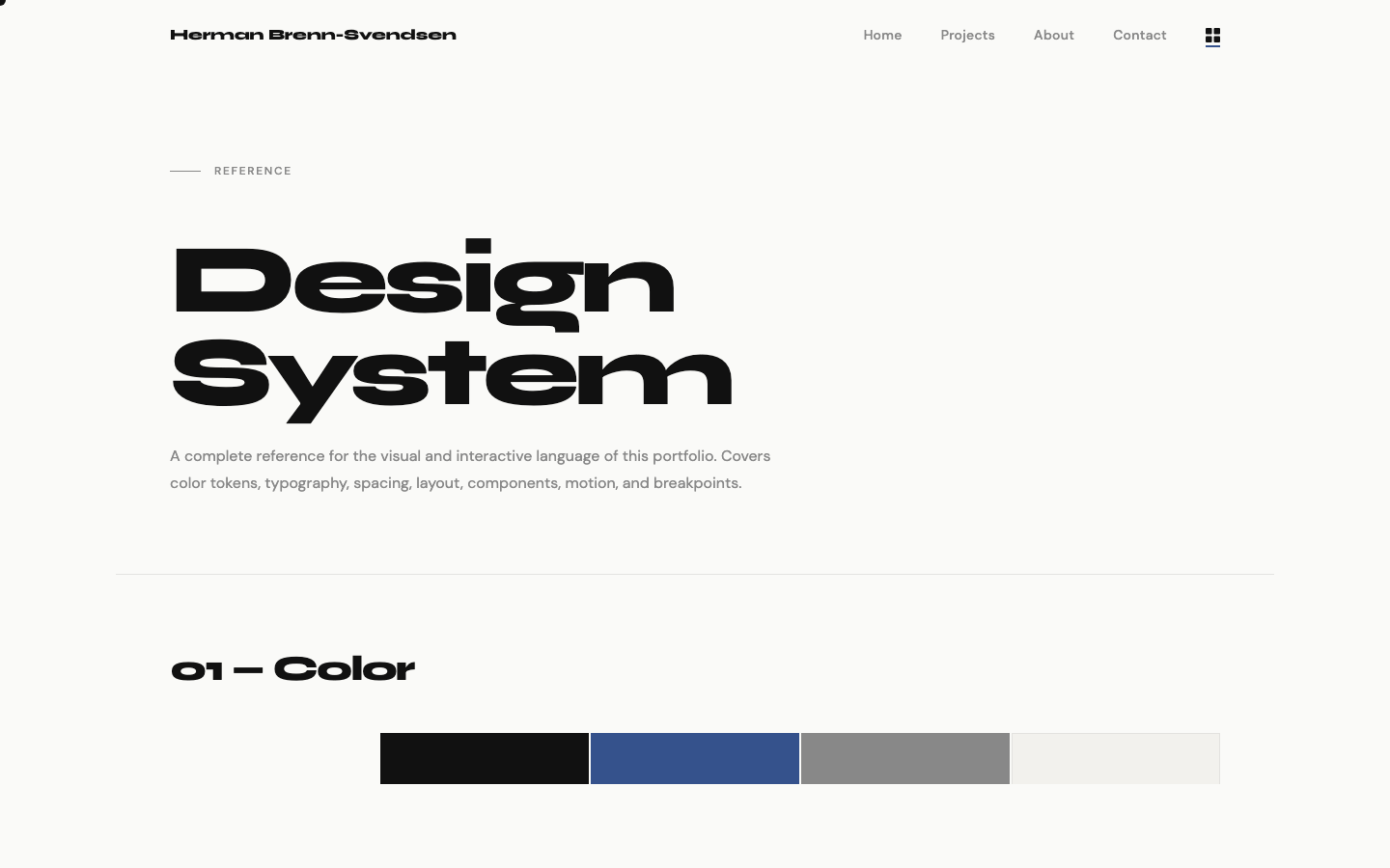
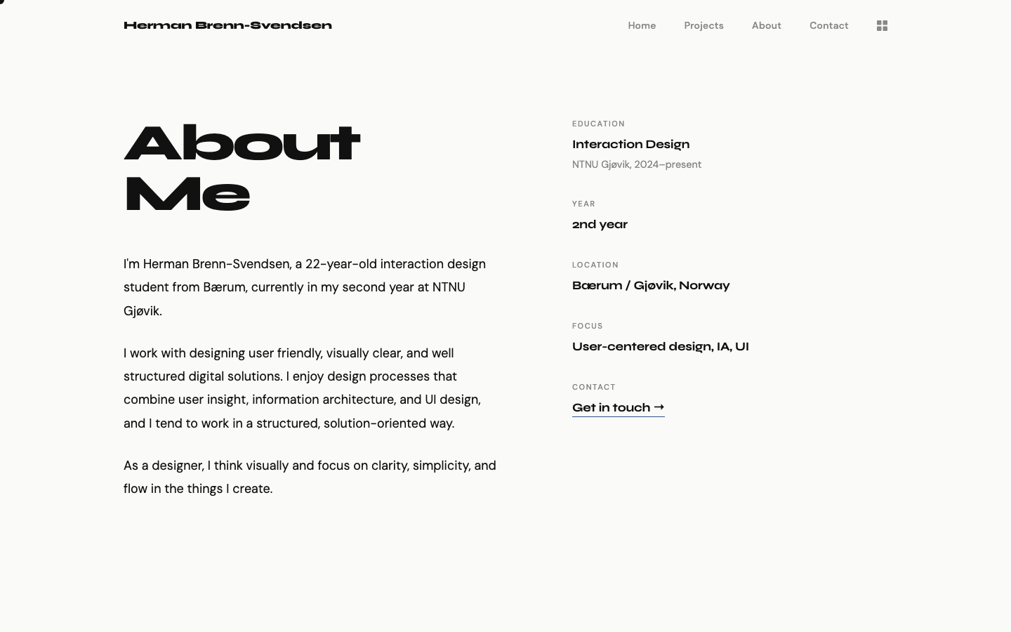
This portfolio is itself a design project. The plan was straightforward, to build something that presents my work clearly, loads fast, and feels considered without being too much. No frameworks, no build tools, just HTML, CSS, and a small JavaScript file. Every decision was made from first principles, which forced a level of detail that template based tools like Framer tend to stay away from.

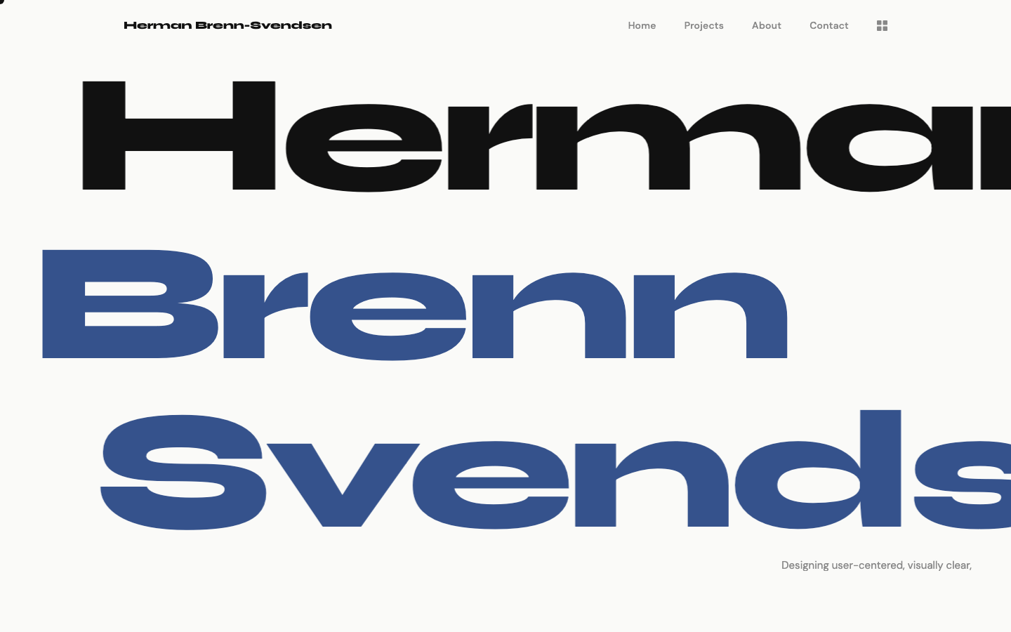
The visual language is built around a tight set of rules, five colour variables, two typefaces, and a 4px spacing base that scales consistently across the different components. A horizontal hero replaces the static name treatment, with each of the three names animated at a different speed. Images default to gray and reveal colour on hover, keeping the page visually quiet until the user engages. The custom cursor both scales and shifts colour on interactive elements, adding a layer of visual feedback without being distracting.

Typography is set in Syne for display text and structural elements, and DM Sans for body text, a pairing chosen for the contrast between Syne's weight and DM Sans's humanist style and readability. A design system page documents every design choice, component, and motion behaviour used across the site, serving as both a reference and a demonstration of the thinking applied to the project.

Web Design HTML / CSS Typography Design Systems Personal Project 2026
07

Logo

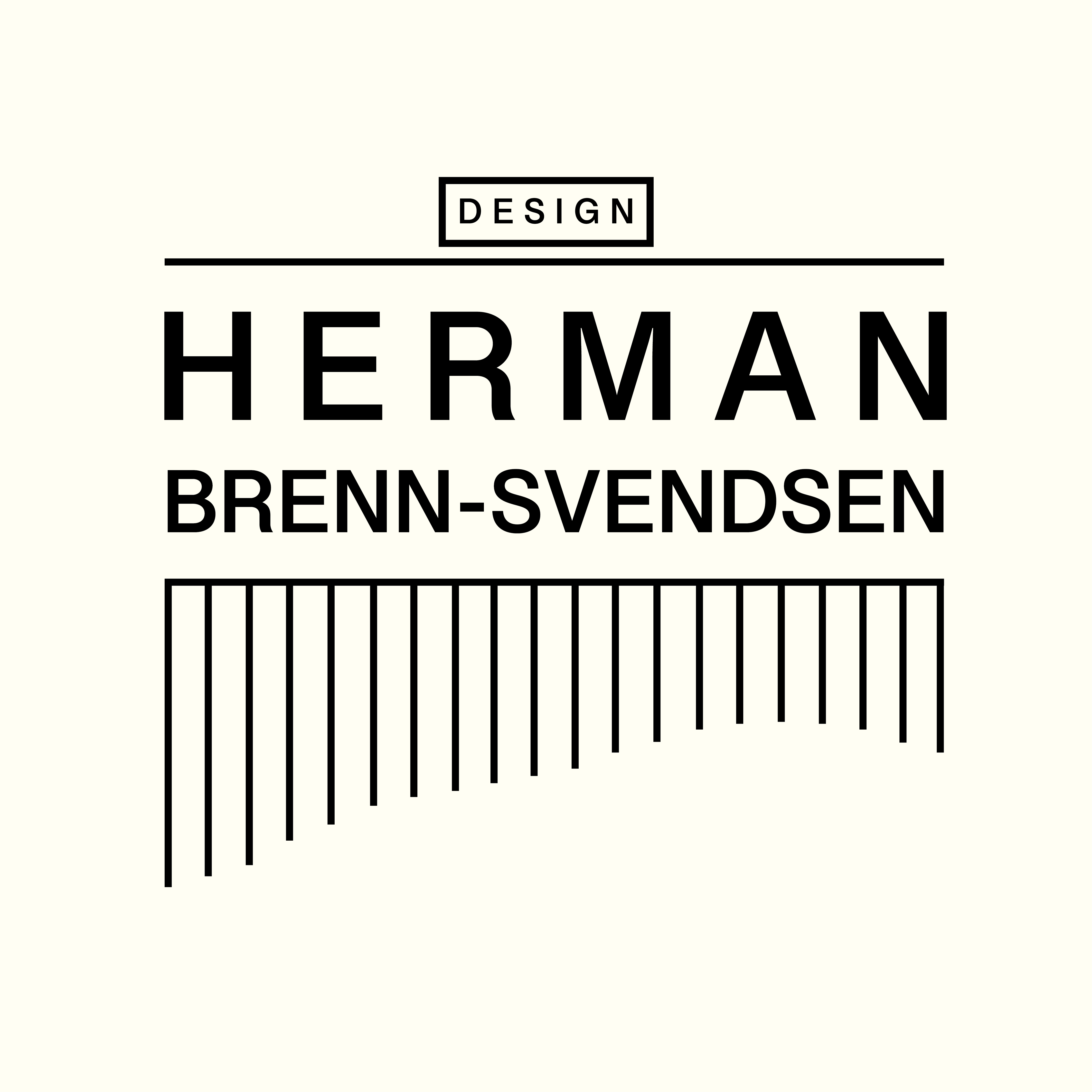
A collection of logo and visual identity work developed alongside coursework and personal projects. Each mark is approached as a design problem in its own right: how do you reduce an organisation's values, personality, and purpose into a single, durable graphic form?

The work spans different contexts and constraints, but shares a consistent underlying philosophy: clarity first, character second. A logo should work at any size, in any colour, and feel immediately right to the people it represents. Complexity is earned, not assumed.

Visual Design Branding Identity 2025
Logo design collection